BUILD 2012, Redmond, Day 1, 30 Oct 2012, 2:15PM – 3:15PM
Will Tschumy
Principal user Experience Advisor
2-116
Why I joined Microsoft
- In 2003, Microsoft made strategic investment in design
- User experience thinking, re-design of Microsoft Word
- Results: Office 2007 was fastest selling, most critically acclaimed version of Office
- $20 billion / year bet on design
Next: Launch of Windows Phone 7
In 2007, same design language on XBox
- Single consistent design language across all screens: phone, desktop, XBox
For Microsoft, our design principles are the language for our experiences
- For customers–confidence, comfort & familiarity
- Brings us together
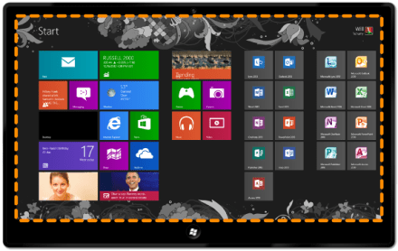
Windows 8 start screen:
Weather app:
No chrome, edge to edge, all about content
The core idea
- Content before chrome
Windows 8, did a lot of research
- Asked Windows & OS X users what they remembered about using Windows
- They drew the chrome
- Then play with Win 8 prototype
- Drew content in rectangles
- With Windows 8, main thing users remembered was the content
- Get OS out of the way of the users so that content can come through
Easy to get to edges, so we put controls there (charm bar, application bar)
- Helps get chrome out of the way
Started thinking about monitors being sold
- Most are widescreen
- So flow content horizontally
- Semantic zoom–no extra navigation for user
Five principles of Microsoft design
- Pride in craftsmanship
- Be fast and fluid
- Authentically digital
- Do more with less
- Win as one
Pride in craftsmanship
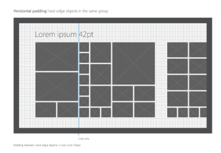
- Attention to detail: Every pixel counts
- Safe/reliable – behave properly on other devices
- Balance, symmetry, hierarchy
- Tiles don’t need to be uniform
- Doesn’t have to be rectangles
- Can cheat margins, but do it deliberately
- Sample apps (Hulu Plus pushes off margins)
Be fast and fluid
- Design for touch – touch first
- Responsive – important when touching, must be responsive
- Intuitive interaction – because of touch
- Drag things in, drag things out
- Immersive and compelling
- Delight with motion
- Life is mobile
Demo – Start experience, Netflix, Photos
- Start Screen is very responsive; stuck to finger
Netflix
- Animation library – lots of little subtle gestures
- Arrow drops down menu
Photos app
- Very responsive
- Pinch out, get to larger view, see more photos
- Ghost effect
- Sense of quality, elegance
Authentically digital
- Embrace the medium
- What is the role of design?
- What is the role of the designer?
- Is design inherent, or surface?
- Modern
- High Modernism, or International Style
- Bauhaus
- Designer should be offered no refuge in the past but should be equipped for modern world in its various aspects, artistic, technical, social, …
- Icons – what value is there in having icons look like real objects, or shaded
- E.g. Windows Explorer – most stuff in there is chrome
- Semantic zoom in file explorer in Modern
- Genesis of live tiles & semantic zoom
- Cloud connected
- Bold, vibrant colors
- Motion
Do more with less
- Be great at something
- App fantastic at one specific thing
- Focused and direct
- Help users focus on what matters
- Content before chrome
- Only show secondary stuff (e.g. photo info) on swipe
- E.g. Web browser, everything other than content is off screen
- You see a bunch of widgets on each element, for discoverability. Remove them and only show when relevant
- Inspire confidence
Win as one
- Work together to complete scenarios
- ~45 separate contracts
- Fit into the user experience model
- Leverage the platform
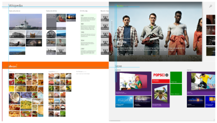
Demo – Search, All recipes and People, IE and Wikipedia
Search
- Don’t need search charm; just start typing
- Good example of contracts
- Allows: surfacing your app in other contexts
- App that you search most often will bubble up to the top
Share
- E.g. allrecipes
- Share, People app, Facebook (from allrecipes app)
- You avoid APIs to all these other services (e.g. Facebook)
- “Catching” application worries about its API
Wikipedia
- From News app, select text, Share to Wikipedia–looks up that topic in Wikipedia
Think about how your app gets embedded in the user’s broader workflow
Windows reimagined
- “The beginning is a delicate time…” –David Lynch, Dune, 1984
- Asking us to reimagine our apps
How will your apps be reimagined?
How can you be authentic to the medium
Where will your app become alive?
What do your users need to focus on?
Integrate with the ecosystem?
Resources
- Design.windows.com
- Windowsuserexperiencetraining.com (9 hrs of training)
Q&A (33:47)
Wikipedia–Share vs. Search
- Share: lets data get looked up from within the other apps
- Even within Wikipedia, just start typing to search
How complex is sharing? Data models passed between apps?
- Yes, you can pass structured data, data types (e.g. URL, picture, etc)
- The more esoteric the data, the more reliant you are on the catching app to interpret
Sharing text, interpret as URL, if not URL it fails and have to display to user
- Probably a better result if you just accept URLs
How should devs refer to “Metro style”?
- Won’t get into details of why no longer “Metro”
- “Windows 8 Store Applications”
In what users remembered from Windows 8, were they remembering content?
- Yes, they remembered images–rectangles were the content
This design language works great for content consumption. What about creation, wouldn’t we want chrome like toolbars to be there?
- Take a look at painting apps
- Evernote Sketch – quick annotations
- App bars pinned open
- Users typically doing a lot of interactions
- At other end of the spectrum, e.g. Sketchbook
- Almost all canvas
- Only need app bar when you change tool, which is less often
- So think about the goal that you’re trying to solve
- If user will spend a lot of time on the content, then worth focusing on content and get the rest of the stuff out of the way
- But be very careful about pinning app bars open
Snap and fill view–design rationale for being able to snap out, but not snap in?
- Keep user in control–risk in going into snap of having it snap unexpectedly
- Coming out of snap–they know they are already in snap view
Interaction design pattern library for Windows 8?
- Look at design.windows.com
- Navigation styles, app bars, commanding
- Human interface guideline document (280 pgs)
- Photoshop templates for mocking up
- Visual Studio 2012 Ultimate installs some prototyping tools in Powerpoint
For HTML, should sites be designed the same way? Any guidelines?
- You can use HTML5/JavaScript to build app or to build web experience
- You’re starting to see tile-like interfaces on web sites
Discoverability–is it a tradeoff, where users don’t know how to do something? E.g. Mom/Dad
- We have looked at that
- Devs should follow patterns that Microsoft is establishing
- Following these patterns leads to consistency
- Then users learn this stuff faster
Font size – 42 pts for headlines. How do you decide how big to make font on various devices? For largest display, when you’re further away, the font doesn’t look large enough
- You can use brand fonts, but you should follow “type ramp”
- Various ratios between font sizes and screen
- Scaling–two strategies for an app
- Everything gets bigger proportionately (e.g. Photos)
- OR You show more content (e.g. Maps)
- Depends on your scenario
- With bitmap images, you should provide multiple images
- 140%, 180%
- Windows 8 will automatically pick appropriate resolution
Recommendations for designing app that does a lot of data input?
- There are relatively few apps right now that do this
- E.g. Credit card terminal apps
- What’s important? Quick, vs. entering data correctly
What kind of impact will design principles have on desktop applications?
- You’ll already see this, e.g. Office 2013 preview, animations
- The animations let you know where on screen to focus
- Biologically, we notice motion / movement
- Reader experience in Word–fast/fluid
- Powerpoint, slide transition
- Entire company (Microsoft) is behind this, pushing these principles
Difference between Microsoft design principles and Windows store apps?
- Same thing


